Saint Pierre le vignoble
©2023 & 2025
- Art Direction
- Print Design
- Video Direction
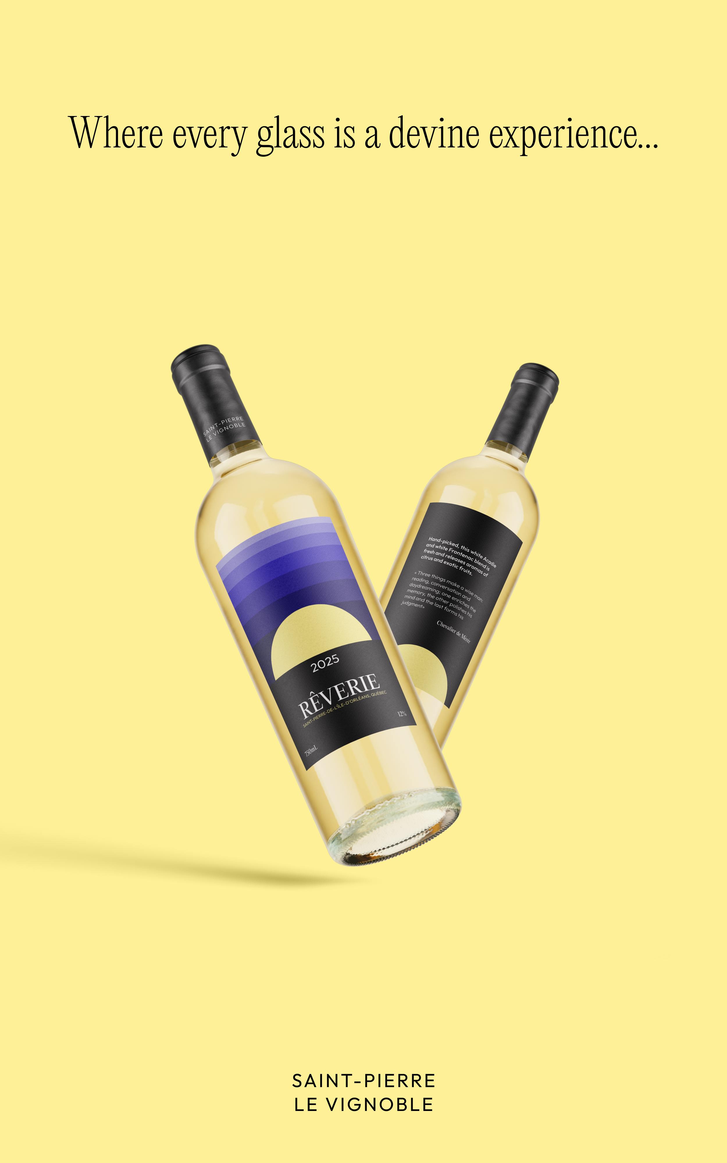
Where every glass is a devine experience...
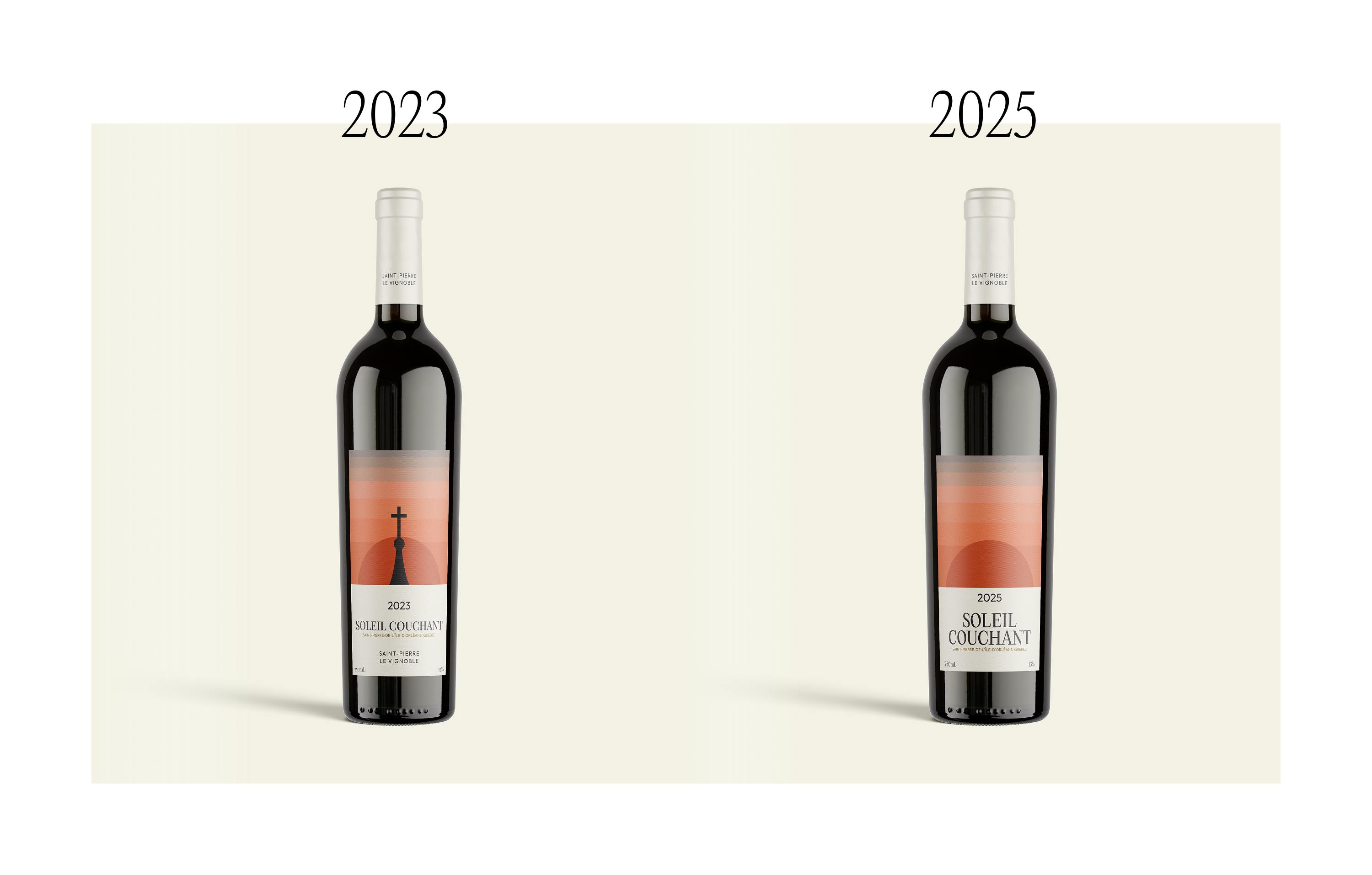
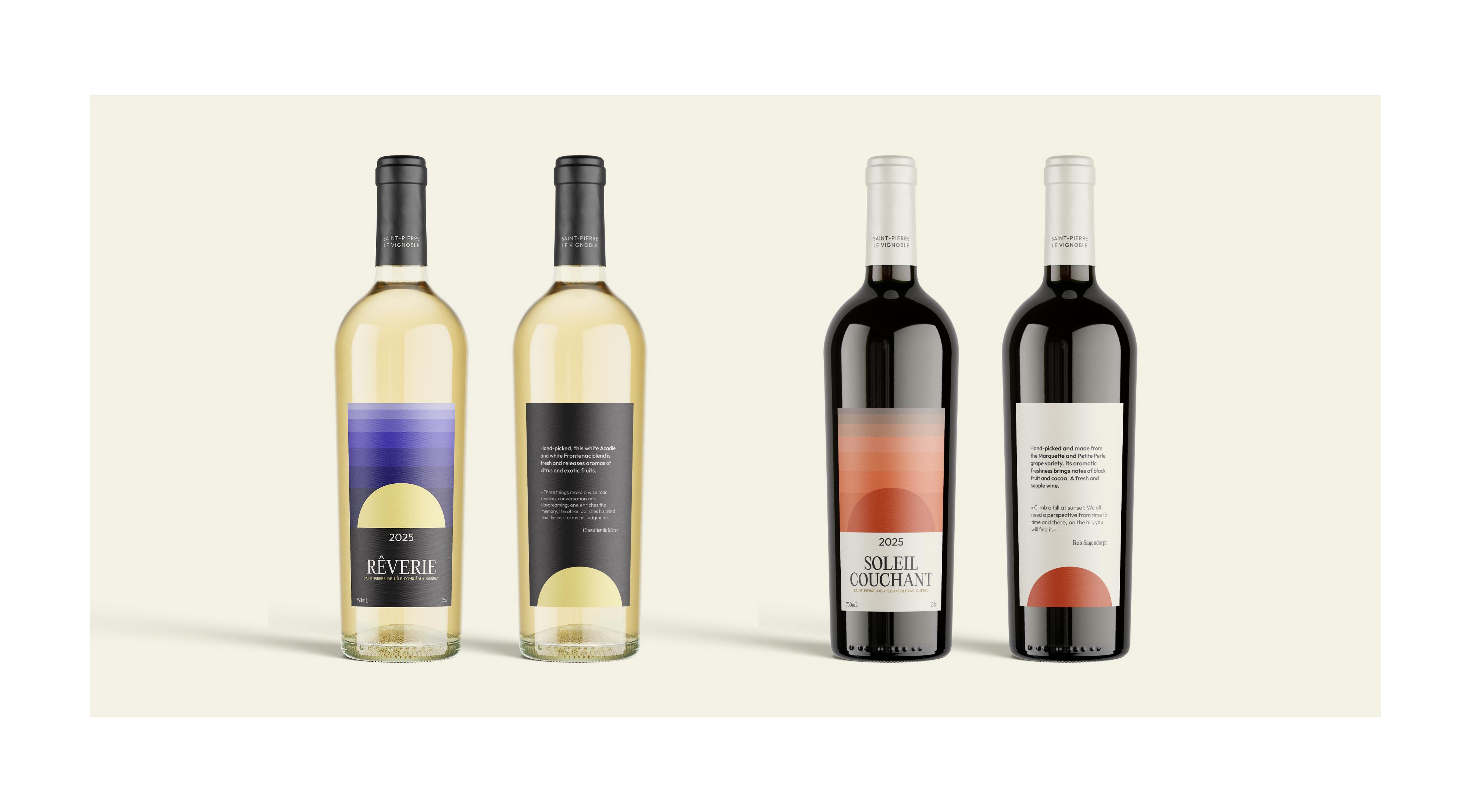
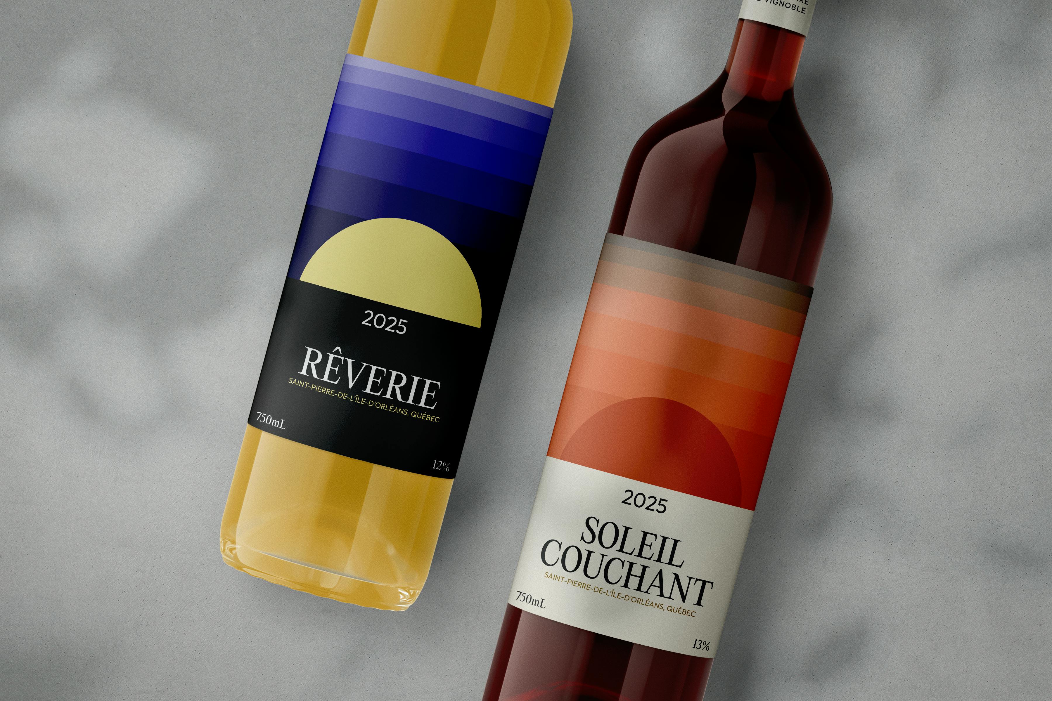
Saint-Pierre Le Vignoble, on Quebec's Île d'Orléans, produces a wide range of handcrafted local wines. As typographer and graphic designer Paul Marchiset chose to spotlight two of their cuvées — Soleil Couchant and Rêverie — through a twofold approach combining illustration with an informative layout, while carefully respecting the hierarchy of each element. For the illustration I drew inspiration from the church in the village of Saint-Pierre-de-l'Île-d'Orléans, stylizing its apex and adding a color gradient to evoke the mood suggested by each wine's name. For the typography I blended elegance and modernity, using a serif for the dynamic, variable text and a clean sans-serif for the fixed, supporting elements. About two years later I revisited the project with fresh eyes to align it with my evolving vision as a graphic designer. I removed elements such as the church bell tower from the original composition and refined the layout into a cleaner, more harmonious whole — swapping the original type for a more modern yet still serif typeface, and meticulously readjusting spacing, colors and font sizes to improve the balance and elegance of the final piece.